Newsonomics: From “Service Desk” to Standalone: How The New York Times’ Graphics Department Has Grown Up

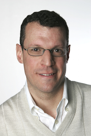
Since he arrived at The New York Times in 1999, Steve Duenes has seen a lot of change.The Times associate managing editor for graphics finds himself in the midst of multiple revolutions. “Graphics” have moved from their supplemental role in the old world to center-stage on our smartphones and laptops. Smartphones themselves now demand unprecedented thinking in miniaturized storytelling. The newsroom itself has become a different place, with budding collaboration slowly easing out members of competing desks.
 In my column this week, I focused on the Times’ creation of what I believe to be the most successful mobile news product. Duenes is one of the many behind-the-scenes leaders of its creation. Our conversation about the changing role of visuals in the business, lightly edited and condensed, is below.
STEVE DUENES: Several years ago, there was a project to create more flexibility in the presentation that we could achieve on the phone and, specifically, in the core app. We called it the “mobile imperative.” More than a decade ago, a majority of our work went from being print to focusing on the web, focusing on desktop, and figuring out what “mobile-first” really meant.It meant a number of things. It meant more than just a design approach; it meant focusing more resources on news coverage and even breaking news. This is a little bit of a shift within the [graphics] department. It meant doing explanatory journalism, visual explanatory journalism.
We wanted it to be faster, and we want it to be lightweight. Then we needed to develop some ways of working that would be elegant on the desktop, with a responsive design that could be built quickly for the phone….We started to make that shift by building out lots of graphic stories. The Upshot creates a lot of these, with a combination of images, words, and graphics.
DUENES: Fifteen or twenty years ago, Graphics was more of a service desk. It’s not a service desk anymore. The graphics department is really a news desk and works in parallel with the other news desks like Metro and National and International.There is coordination, and there’s a positive effect from that coordination, but especially with news coverage and breaking news, it is independent work. The graphics department figures out lines of reporting, does the reporting, starts to build visuals. There are small teams that form organically and quickly around how we’re going to respond to these stories.
DUENES: It was gradual. It took time because the culture of the newsroom had to accept it. There are a lot of desks that kind of feel like this is a part of their report and they should order these things up to be part of their report. If it’s an independent desk, and it becomes a different conversation, it takes a little while, culturally, to get to that different conversation.The graphics desk can publish something on its own and then, the next day, point it out to the national editor and have the value of that piece be apparent. That’s the kind of thing you need to make that cultural change, and that’s what happened in this department. The graphics department decided — before the newsroom really got into the swing of switching into a digital-first operation — that that’s how they were going to work.It’s just grown from there: The desk has grown, the reporting resources in the department have become stronger and the additions have been people with deeper, specialized skills, developers, cartographers who are also coders.

DUENES: Yeah, that was a nice piece…I do think it’s, like, getting to a place where you’re sort of on equal terms with a written article. That’s what we want, and I think that’s where we’re going.Some of the graphics, if we are turning them around quickly, can be as simple as, for example, two visualizations, an extended caption, and applying it together to make a larger point. Some of them are more elaborate versions of those.
Large numbers of people are viewing them. The traffic on the explanatory stuff has been strong, but the question that we were asking ourselves was, “Are we getting a little formulaic?”
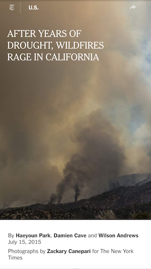 We’re asking, “Do you want to try to take stories that are built around explanatory visuals and push in a narrative direction?” One piece like that was a curtain-raiser on wildfire season in California. One graphics editor had done a lot of reporting and figured out very early in the season that there had already been many more fires than in previous years, and because of the drought, it’s just going to be a disaster.
As visualizations, they were a little abstract. They were not necessarily put-you-there kinds of visuals. We started to talk to the national desk and it was a great start to go to a fire, do some on-the-ground reporting, and set this story as: Here’s a fire that’s happening now, here’s the next one that’s coming up.
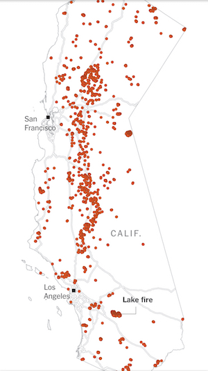
DUENES: If you scroll down that story, it started with that map of the entire location from January to July. We started with that, the fly-over aerial survey of all the dead trees, and some of the charts. We were thinking of stringing it together as a graphical kind of explanatory piece: Wildfire season is going to be bad.The rest of the piece grew out of that. Now, the intro to the story addresses the scene you’re looking at in the photo that sits behind it. With the next photo, you have more copy about firefighters hacking along the canyon of smoking flames, and you’re seeing it.
Ultimately, we’re talking about this relationship between [different types of] visual information. It could be visualization, it could be photography, it could be video, it could be the word. There’s a power to that relationship.