
Newsonomics: The New York Times’ Redesign Aims To Support Its $500 Million Digital Business

Please sign in.
Those three words — a request as old as the web — now drive the strongest strategy of our news era: reader revenue.

Today, The New York Times announces and starts to rollout the most significant redesign in its digital history. That redesign, 18 months in the arduous making, won’t turn heads or surprise many eyes, but its underlying thinking aims to empower the Times newsroom to deliver more timely, more nuanced, and more dramatic products to its readers — and thus for the Times to get more readers to pay for more of them. With this move and others, the Times aims to provide more and more reasons for readers to log in and get a constantly improving product offering as they move from phone to desktop to tablet to audio-on-demand and, eventually, to the new TV. Though the changes may not be flashy, they represent a significant change in strategy.
The Times calls the new system Vi — pronounced “vie”, not “six.” (Times watchers will note that an earlier redesign team was called NYT5.)
First published at Harvard’s Nieman Journalism Lab on June 13, 2017
Follow Newsonomics on Twitter @kdoctor
“People are inundated, surrounded with information 18 hours a day, and we understand that they get it from a variety of sources. So the question is: How do we, at any given moment across the day, across the globe, present the report in the most meaningful and easily accessible way that we can?” says Kinsey Wilson, the Times’ editor for innovation and strategy and executive vice president for product and technology. “That shift from platform to reader is what I would say is emphatically the pivot that we are making here.”
2015 and 2016 were all about platform for major news publishers — social discovery, distributed content, feeding Facebook — and this return to reader-centricity happens even as Facebook finally plans more publisher-friendly, subscription-supporting features. For the most part, the money in digital news is in attracting and retaining paying subscribers. Facebook, Google, Twitter, and other platforms can acquaint readers with top news brands, but it’s the on-site, on-browser, on-app experience that’s got to seal the deal.
“This year is the year for us to deliver on both our journalistic and our business ambitions,” Wilson says. “We not only have to create what we feel is one of the finest news reports in the world, but we have to deliver an experience that is the equal of the journalism.” That experience is based on product and service. It’s not the stream of news, as impressively as it has gushed this year; it’s how usable, convenient, and accessible publishers can now make it. Make no mistake, every slide from Mary Meeker, comScore and more confirm how much news reading has become a multidevice adventure. One goal here then is to make that journey more seamless.
“We know from our research that multi-platform/device subscribers retain better,” says Wilson. “A key differentiator is that readers who read broadly across a variety of subjects are more likely to subscribe and retain.”
He says the Times has overhauled its end-to-end digital publishing system “with the goal of being able to move with much greater speed, to do a better job at serving our audience, to create a systematic experience across all platforms…It lays the foundation for a much more rapid system of iterative development.”
That process includes moving the Times from running six platforms to a singular, responsive publishing system. “If I want to adjust a feature on the site today,” says Wilson, “I’ve gotta touch six different stacks of code to do that. What we’re moving to is pretty much a single stack.”
Ironically, the work, led by Wilson’s teams, should make life easier for the new product teams to be redeveloped as just-promoted COO Meredith Kopit Levien assumes responsibility for them, and Wilson leaves his position.
Readers will notice some changes — on the desktop NYTimes.com, on the mobile app’s display, in slow-moving personalization — over time, but Wilson says that only 10 to 20 percent of the impact of what’s possible will be seen soon by readers: “This is really just a huge investment in the next couple of years of product development.”

Let’s consider how this all fits into the Times’ subscriber-first strategy — which parallels similar strategies now being pursued by big players on both sides of the Atlantic. Take, for instance, Schibsted’s major second-generation platform initiative. In offering a bevy of tailored reader benefits (touts to stories of personal, contextual usage), “we will have 100 percent logged in users,” Terje Seljeseth, Schibsted’s chief product officer, told me last month. Quid pro quo: sign up, sign in, and get more — or stay anonymous and get less.

Within the last year, Schibsted’s popular daily VG has seen a 27 percent increase in digital subscriptions, and the company intends its technology to glue those payers and entice more of them into the fold.
Of course, The Washington Post’s Arc platform both meets and anticipates next-generation publishing technology needs as well and can claim partial responsibility for the Post surpassing 500,000 digital-only subscribers this year. News Corp — its technology strategy now led, in part, by two former New York Times executives, Marc Frons and Rajiv Pant — likewise looks to how its technology will build on reader loyalty and payment on three continents. News Corp’s Wall Street Journal can count 1.2 million digital-only subscribers.
All these companies emphasize the greater value of getting readers logged in. Their newsletter strategies have served as the newest weapon in that offensive, with the Times noting it has 13 million subscriptions to 50 email newsletters. As I’ve dug into both the Times and Post newsletter strategies, the new value of a registered, signed-in reader has become clear. It leads to greater engagement, increases conversion to subscription, and will power efforts toward that holy grail of personalization. While the Times won’t say how many registered readers it now counts, those millions — gained by subscription, by newsletter signup and more — are the ones this redesign most wants to please. Engage ’em. Log ’em in. Engage ’em some more. Get them to subscribe. It’s the new virtuous circle.
So, what will Times’ readers notice most, and where?
The Times believes that desktop readers will see the most change. In the screenshot below, you see a representation of what some desktop readers will see beginning today.
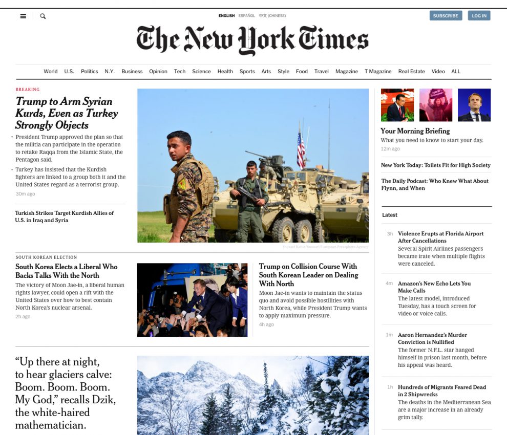

Clearly, the new desktop design borrows from the Times’ highly successful mobile products. I was glad to greet that arrival last yearhere at the Lab and would love to do the same with the new desktop one — but I can’t. The Times is acting on the research-driven understanding that “our home screen effectively communicated the news of the day, but was not as effective in communicating the full breadth of content offered by The Times,” says Paul Werdel, product lead on the home screen redesign and replatforming. It’s clearly more visual, and its top-right real estate resembles the top of the phone product: Morning Briefing, “The Daily” podcast, and New York Today, replacing the large current Opinion block. (The demotion of Opinion might seem odd at this political moment, but maybe the Times’ research backs up that decision.) “Latest” — breaking news — is now emphasized.
But overall it lacks the vitality and the informality that the Times mobile product embraces, still seeming more like an artifact of the 20th century than its in-our-pocket cousin. Perhaps it will evolve over time, or perhaps — as we’ve almost proven in 20 years — no one’s yet figured out how to translate the serendipity of print (and phone) to the deadweight computer.
The phone products will benefit from the redesign, too, of course. Wilson believes the greatest difference will be seen on the Times’ apps. Its two iOS apps — for iPhone and iPad — now will exist on a common codebase. “You’ll see only subtle design changes, at first, but you should see enhanced performance — and what we really get is the ability to publish web pages into it that are beautiful and fluid and include the vast majority of the features that we’ve been developing into our story pages, but have always had difficulty getting into our apps because we had to rebuild them in our apps.”
App users have come to become more and more meaningful for the Times — and for their peer competitors. In May, the Times’ iOS and Android apps represented 27 percent of its daily active user and generated 37 percent of its overall pageviews.
As of today, the Times will have released the new mobile browser version of the redesign to about a quarter of its users, with the new app iterations deploying soon.
Perhaps no potential impact of this redesign may be as important as “personalization” — a term some in the news business complain has now lost all meaning, given both its immense possibility and vagueness. For the Times, personalization so far has meant mostly a little geolocation — tailoring newsletter and other delivery by continent and more.
Since at least the introduction of My Yahoo (which required active selection of user preferences) two decades ago, personalization’s been a fraught word in the news business. Remember the debates about “one to many” and “many to one” and “one to one”? They’re still in the air, but the technology — and the analysis of reader data — has clearly matured. Personalization — a harder or softer tailoring to signed-in readers’ preferences — is now much more doable. And it will be part of what the Times, along with those other advanced tech players in global news, will test out this year. But their caution remains.
“We have to be very careful that people don’t feel that we’re any way limiting or restricting or filtering the news report,” Wilson says. “One of the things Times readers value most is the serendipity of the Times. What they get from the Times, and the knowledge that what they see, other people are seeing, and that the judgment of Times editors is being fully applied to things. So we’re not gonna mess with that.”
Quite true — that’s part of the brand promise of the big publishers who have generated hundreds of thousands of paying digital readers.
Still, we all want a little more of what we like most. So the pages we get — over time — will reflect that, a game of percentages that I believe will be imperceptible but agreeable to most of us.
As the new desktop NYTimes.com rolls out to 1 percent of the audience today, this redesign also marks a major departure in how the Times debuts its technology changes.
“Last year, we were still very much in the waterfall mode, where design had a high degree of control over how the redesigns were being executed — things were finished to within a pixel of their lives, and the redesign was pushed out the door to pretty much 100% of the audience,” says Wilson. Today, as that desktop audience tests out the new tech, the Times believes it can adjust to needed changes on the fly. “You get it in front of people, see how they react, get their feedback. We will notify people that they are in the test, and we’ll give them the ability to flip back to the current site. It’s the best way to do development and understand what’s really working for the audience and what’s not, rather than doing endless research and testing and trying to survey people and get stuff in front of them.”
There are a half billion other reasons for avoiding flip-the-switch changes. Says Wilson: “We now are running a $500 million digital business, and you don’t want to be making big, disruptive changes without understanding the economic consequences.”